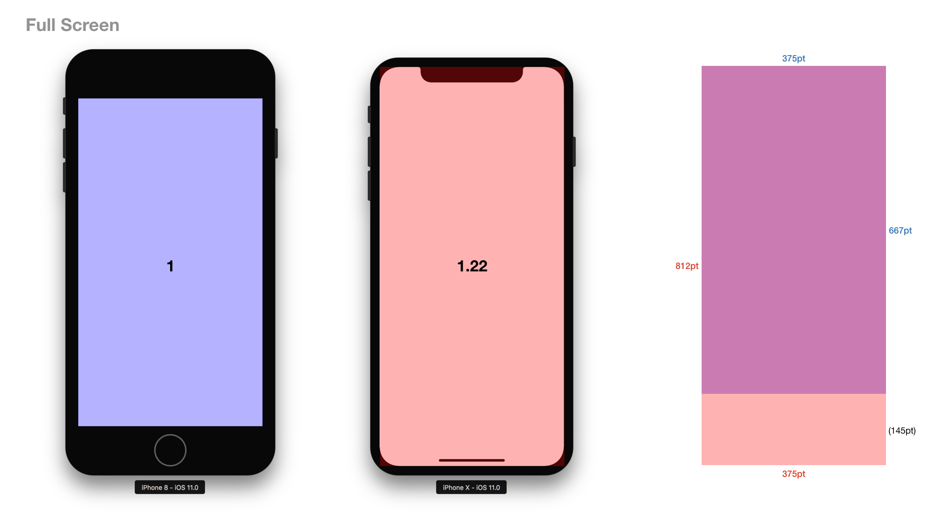
According to iOS Human Interface Guidelines, the width of the display on iPhone X matches the width of the 4.7″ displays of iPhone 6, iPhone 7, and iPhone 8, and, the display on iPhone X is 145pt taller than a 4.7″ display, resulting in roughly 20% additional vertical space for content.
However, as you may know, iPhone X has a notch on the top edge, and it has a space that should be preserved on the bottom edge for swiping to access home screen (the space seems to have no name yet). This actually means that contents and UI elements are to be displayed inside the Safe Area Layout Guide, a logical layout guide the system provides dynamically to avoid placing elements overlapping with status bar, navigation bar, toolbar, tab bar, the notch, and the bottom swiping area.
Now a question is raised. If you cannot place elements around the notch and under the bottom swiping space, is iPhone X’s screen real estate where developers actually place elements really that large (+20%) in comparison with iPhone 6/7/8’s?
OK, I have tested with the simulators.
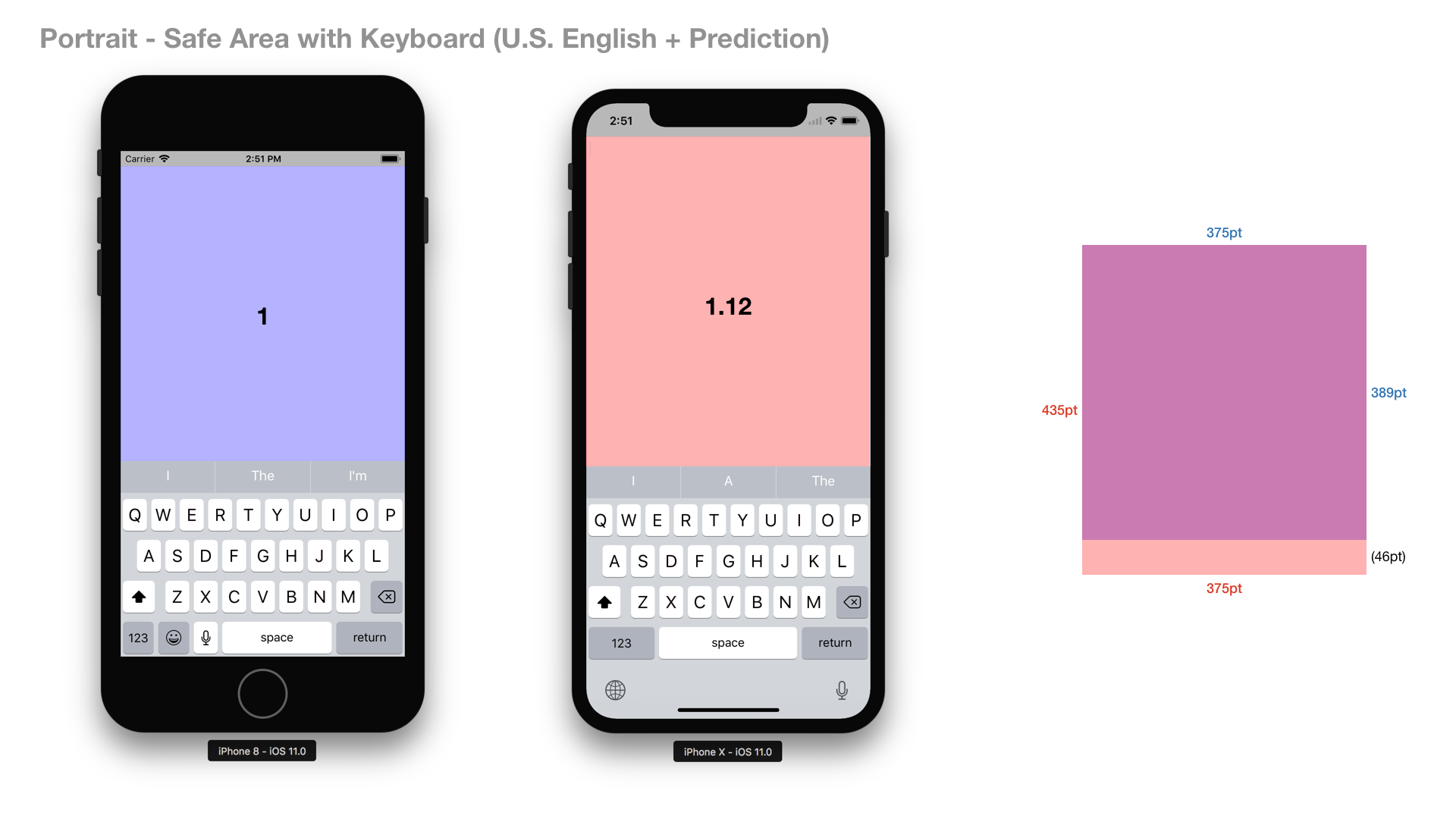
Results
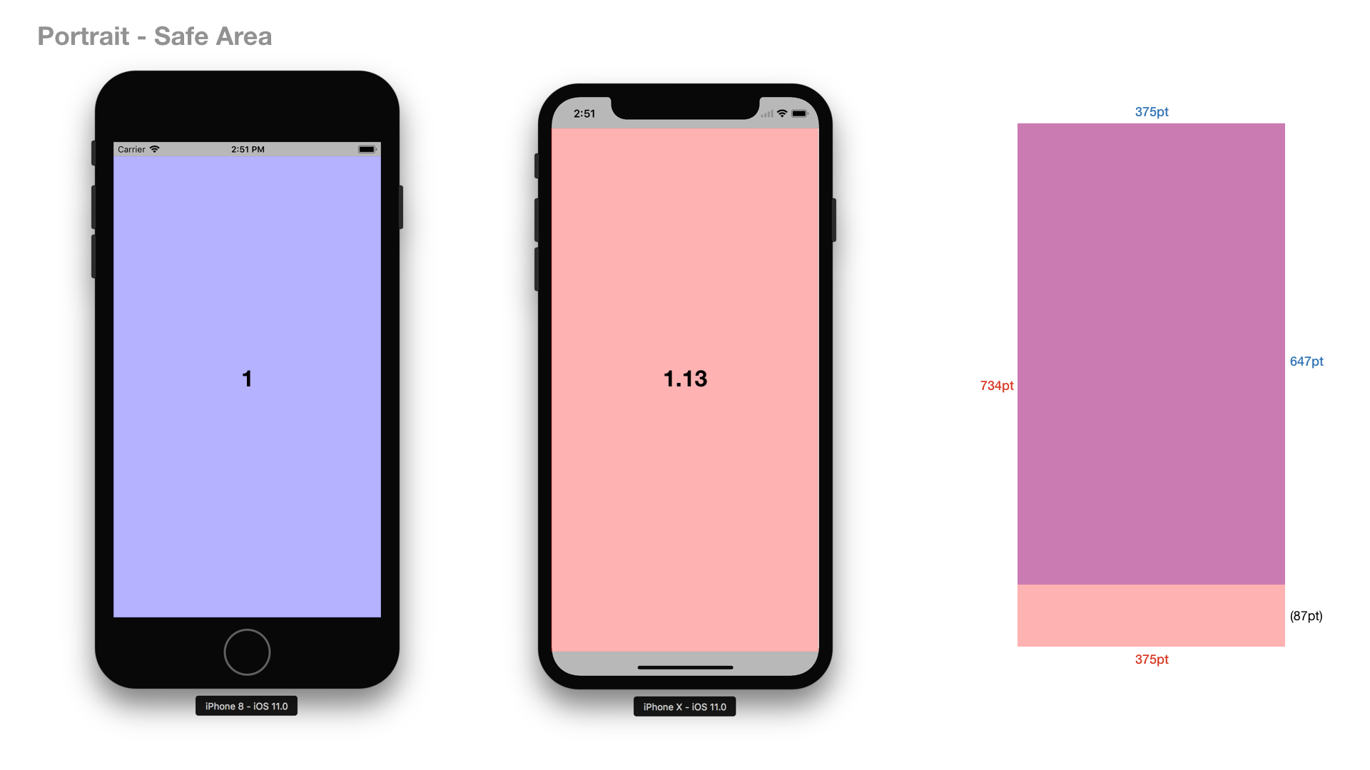
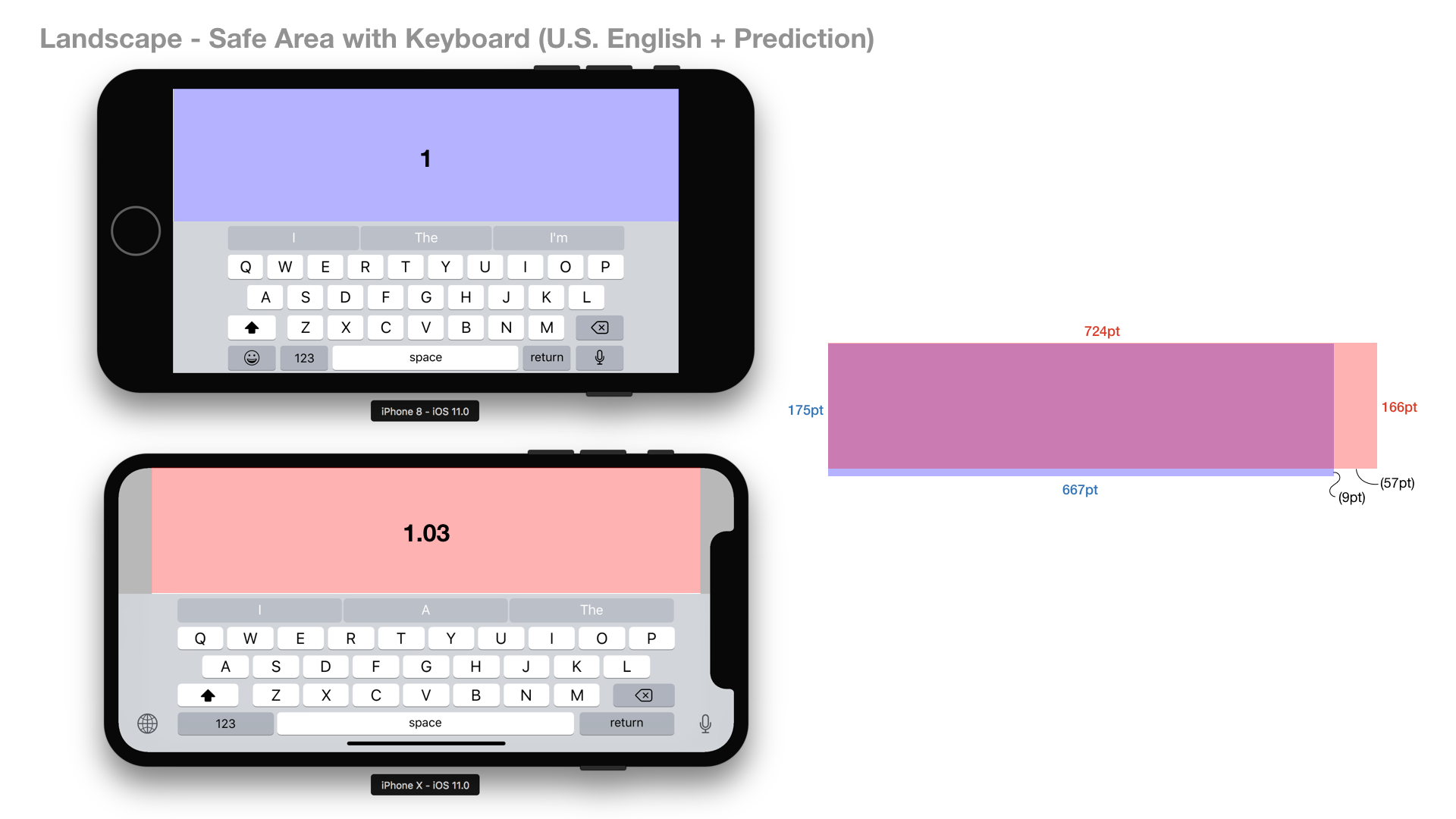
As full screen, iPhone X has 22% larger real estate in comparison with iPhone 6/7/8. However, as safe area, it is only 12-13% larger.
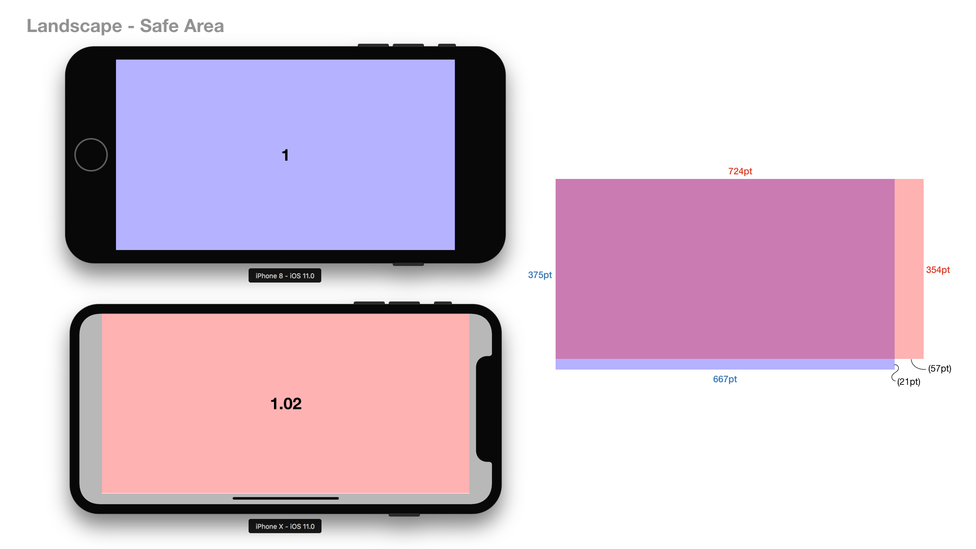
For landscape orientation, the area of iPhone X’s screen real estate is almost the same as iPhone 6/7/8’s. In addition, for landscape orientation, the height of iPhone X’s safe area is smaller than iPhone 6/7/8’s.
From my experience, the cost of adapting layout of existing apps to iPhone X’s new safe area layout guide is not small for developers. Do you think it is reasonable effort to gain that amount of additional space on iPhone X?
